Casa Europa
Premium charcuterie brought to life with a sober, powerful visual language that matches its uncompromising quality.
Project tagline
“Real cuts. Real quality. Real flavor.”
A premium experience made accessible—with consistency from shelf to social.
The Brief
“Make us look as premium as we taste.” Highlight meticulous craft, quality, and tradition—delivered with a modern, daring voice for an audience that never settles.
The Insight
In a market crowded with generic promises, Casa Europa stands for the real thing: real cuts, real quality, real flavor. The brand’s sharp, no-nonsense tone needed to live across every touchpoint.
“Authentic flavor. Crafted with tradition.” Premium taste, modern presence.
The Idea
Sober, powerful visuals that mirror the brand’s integrity—no shortcuts, no noise.
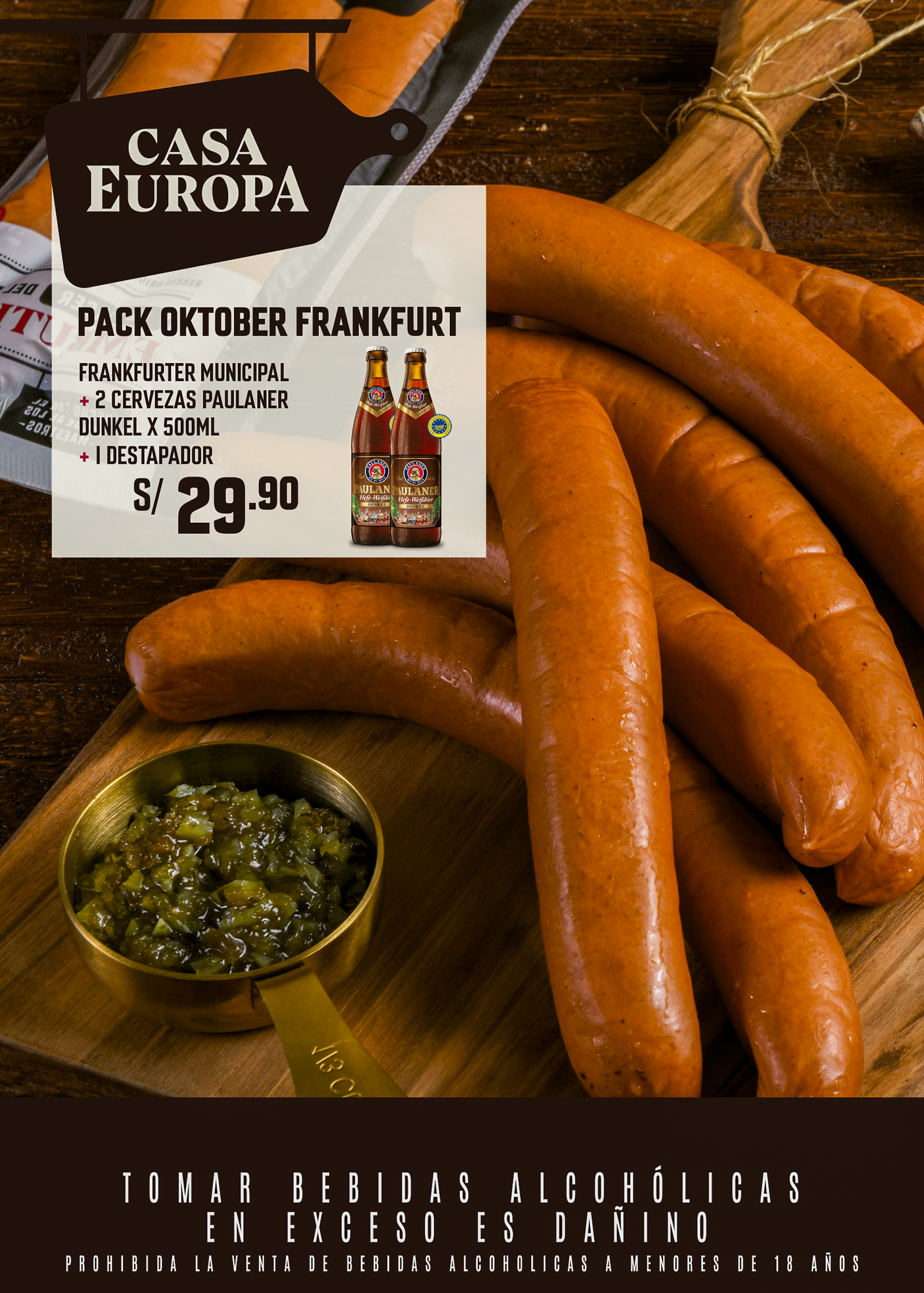
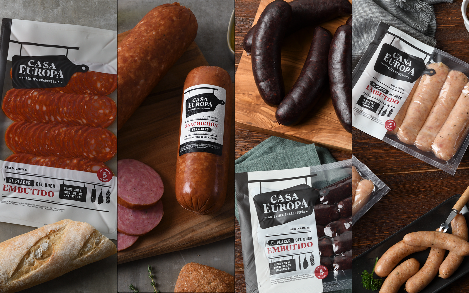
- Premium image across photography, packaging, and layouts—authentic excellence for those who know.
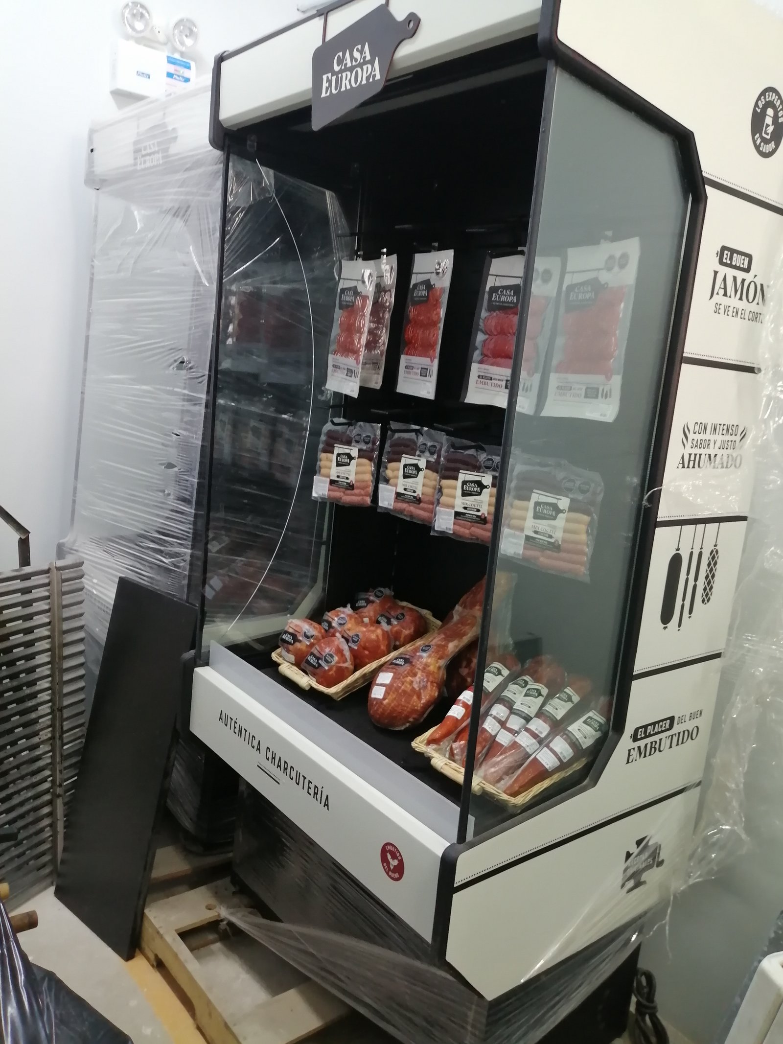
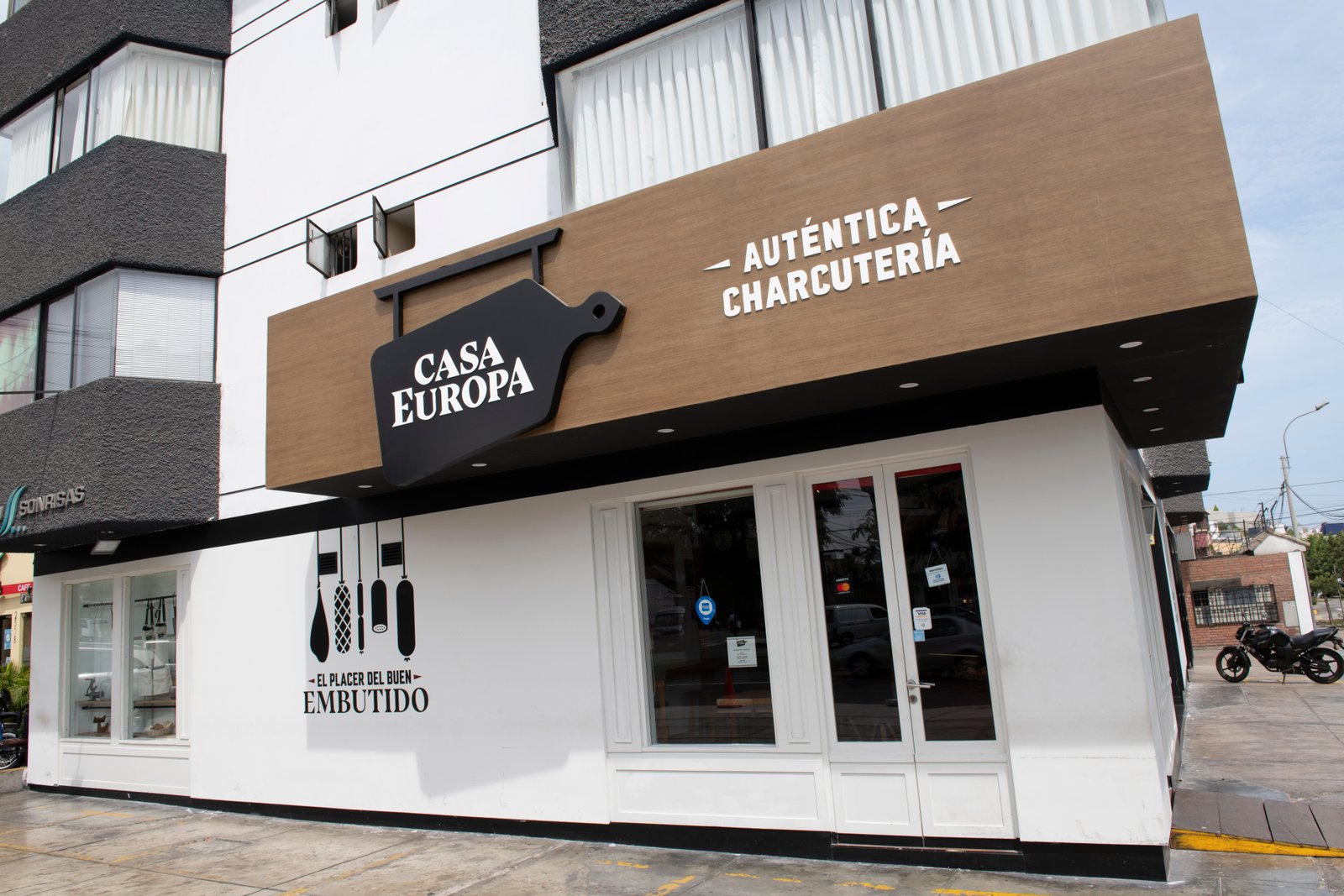
- A complete in-store visual language—displays, signage, POS—building an immersive retail experience.
Got a creative challenge we should hear?
Let’s chat →¿En qué podemos ayudarte?